I was looking at a prospective client’s website the other day.
It looked great.
Professional branding, cool photography, fresh, clean design, clearly, somebody had invested a decent amount of time and money into it.
After about a minute though, I realised something – I still wasn’t entirely sure what they actually did!
Now, that probably sounds ridiculous.
But if I – someone who spends a large part of his working week reviewing websites – couldn’t work it out quickly, what chance does everybody else have?
The truth is, most people don’t read websites in full immediately on arriving – they scan them.
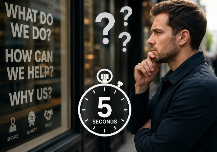
In fact, I’d be amazed if many visitors spend more than a few seconds deciding whether they’re in the right place.
Five seconds, maybe ten at a push.
You’ve probably spent longer than that deciding which queue to join in Tesco.
Yet it’s enough time for somebody to decide whether they trust your business.
So here’s a little challenge for you!
Open your homepage.
Now imagine you’ve never seen your business before.
Ask yourself three questions.
What does this company actually do?
Who is it for?
What should I do next?
If you can answer all three almost instantly, brilliant, but if not, don’t worry – you’re certainly not alone.
One of the biggest website mistakes I see isn’t poor design, it’s trying to say absolutely everything on one page.
Every service, award, accreditation, testimonial – you get the picture.
The irony is that, in trying to tell visitors everything, many websites end up making the most important message harder to find.
Your homepage doesn’t need to answer every question – and it’s much better for Google, LLMs and the like if this is the case too.
It just needs to answer the first one.
“Am I in the right place?”
The rest of your website can do the heavy lifting.
So if you’ve got ten minutes spare this week, try the five-second test.
Better still, ask somebody who knows absolutely nothing about your business to do it for you.
You might be surprised by the answers.
Cheers
Matt