June 19, 2017 •tanmay
There are literally millions of websites out there on the Internet, and if you want to make sure that yours stands out, it’s important that you follow a few simple rules before unleashing it on the public. We’ve come a long way from the clunky, pixel-filled websites of the past, and are now entering a new era where minimalism, simplicity and usability are key. So without further ado, here are our top 10 tips for what makes a great website:
User Friendly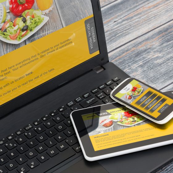

Regardless of what purpose your website serves, it is extremely important that once you actually manage to get visitors to your site that you try everything you can to keep them there for as long as possible. Usability is key, so the more natural, intuitive and simple you can make the navigation, the better. Make sure that the information people are likely to look for is easy to find, and where you would expect it to be. It’s a really good idea to run some tests with friends and family to get feedback on how your website works in the real world.
The right typeface
If you’re not a natural web designer, then you might not notice the impact that different typefaces can have on a website. Simple clean lines, good spacing and an unfussy font will make your page much more appealing and easy to read, keeping visitors on your page for longer and ensuring they aren’t frustrated. As a rule, Sans Serif fonts (modern fonts that don’t have decorative flourishes or finishes) like Arial, Helvetica and Verdana are easier to read online, and the ideal font size is 16px. Use no more than 3 different typefaces and font sizes across your whole website to keep things looking fresh.
Great content
You could have the coolest, most well designed website, but if the content on your site isn’t quality, then no one will stick around. Whether your page is just used as a basis for people to contact you, or you run a blog or content-led site, you need to be producing interesting, well-written content that sticks in people’s minds. Adding a blog to your more functional website is a great way to lure in potential customers or visitors too.
Easy to share
So you’ve got people to your website and they like what you have to say, but that’s not much use if they can’t share your content with their friends. Make sure there is the ability for visitors to easily share your content to social networks like Facebook, Twitter and Pinterest, and you could double or triple your traffic in no time.
Pictures and videos
It really isn’t enough anymore to just put words down on a page and forget about it, multimedia aspects like pictures, gifs and videos are an integral aspect of any self-respecting website these days, and for good reason too. Pictures must be high-quality and interesting, so you might need to get a professional in, or invest in good stock photographs to make your website pop. Eye catching full-page video banners are the latest trend too, which provide a fun, fresh and attention-grabbing intro to any page.
Mobile friendly
It’s an often overlooked fact that people won’t always be viewing your website on a laptop or a computer, and with the rise in smart devices like smartphones and tablets, it’s never been more important to have a versatile website that has a responsive design to fit all types of media. This means that visitors will get the same high quality experience no matter how they access your page.
Control
People like to be in control of what they see and when they see it, so make sure that you include back buttons, visible links and NEVER set links or pages to open in a new window or tab, as users need to be able to travel back and forth throughout your website. The easier you can make it for your visitors to use your website, the more they will enjoy it, and the more likely it will be that they will keep coming back time and time again.
White space
White space, or negative space is the portions of a webpage that don’t contain any text or images. They don’t have to be physically white; they can actually be any colour, as long as they are left free. White space is an important element in any website, as it serves to keep things looking uncluttered, and keeps the focus on what counts.
Minimalism
Tying in with white space, minimalism is the future as far as web design goes, and keeping things simple, clean and stripped back is a great way to make your content shine. Don’t clutter your page up with hundreds of tabs or sections, evaluate what’s important for your site to work and strip it back.
Colour
Bold is beautiful, and choosing a few, vibrant colours to contrast against more neutral tones will make your content stand out. Try to keep things consistent by picking colours that relate to your brand and sticking with them throughout all of your pages. You can even try using strips of colour to break your webpage up into sections that guide the viewer’s eye from top to bottom.
Depending on who you ask, you could end up with hundreds of tips on what makes a great website, but underneath it all, the same few points keep coming up tine and time again. Regardless of what purpose your site serves, and what feel you want your website to exude, having a webpage which is uncluttered, easy to navigate and aesthetically pleasing definitely can’t hurt.
Here at The Bright click we have a highly skilled team of designers, developers and SEO experts on hand to ensure that all our new websites are build to the highest possible standard.
If you would like more information then please get in touch with our web design & development team on: 0208 614 3296